
How to Create Pivot Tables in Excel to Analyze Data
Pivot Table Tutorial for Beginners
Do you find working with data in Excel a bit overwhelming? Do you spend hours building complex tables with formulas and functions? If so, you're in luck! In this step-by-step tutorial, I’ll guide you through the process of using pivot tables in Excel. Pivot tables are a powerful tool that allows you to quickly and easily analyze your data. With pivot tables, you can say goodbye to the hassles of manual data manipulation and gain valuable insights from your information in no time. Watch this video to follow along.
How to Create Pivot Tables in Excel - Pivot Tables Made Easy for Beginners
Step 1: Prepare Your Data
Before diving into the world of pivot tables, you need to ensure your data is well-organized. Follow these steps:
Header Row: Make sure your data has a clear header row with descriptive column titles. This will be essential for creating meaningful pivot tables.
Convert Your Data into a Table: To take full advantage of pivot tables, you'll want to convert your data into an Excel table. Here's how:
Select Your Data: Click anywhere within your data range.
Insert Table: Navigate to the 'Insert' tab and select 'Table' (or simply use the keyboard shortcut
Ctrl T).Header Row: Ensure the box that says "My table has headers" is checked, and click 'OK.'
Now, your data is structured as a table, making it easier to manage and update. When you add data to this table (or edit date in the table), all you have to do is refresh your Pivot Table to incorporate the updates.
Step 2: Create Your Pivot Table
Now, let's create the pivot table itself:
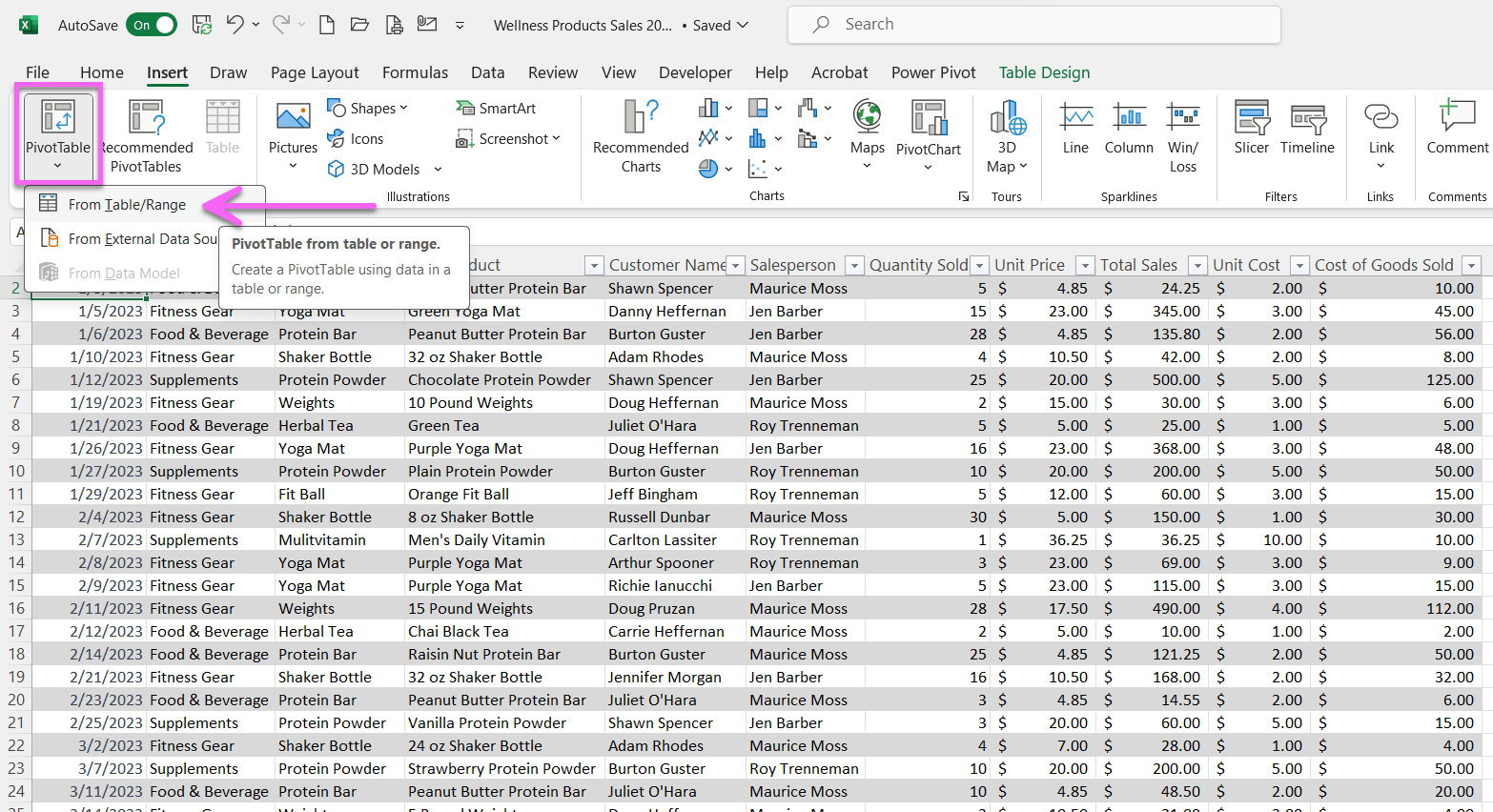
Select Data: Click anywhere within your table.
Create Pivot Table: Go to the 'Insert' tab, choose 'Pivot Table,' and select 'From Table or Range.'
Choose Location: Decide whether you want to place your pivot table in a new worksheet or an existing one and click 'OK.'
You now have a blank pivot table sheet.
Step 3: Customize Your Pivot Table
The pivot table field list will appear on the right. This is where the magic happens. Follow these steps:
Drag and Drop: Select the fields you want to analyze and drag them to the 'Rows' and 'Values' areas. For instance, if you want to see product sales by category, drag 'Product' to 'Rows' and 'Total Sales' to 'Values.'
Value Field Settings: By right-clicking the 'Values' area, you can adjust the calculations (e.g., sum, count, or average) for your data. For sales, we'll keep it simple and stick with 'Sum.'
Format Data: Customize the appearance of your data by right-clicking a value and choosing a desired format, such as currency with two decimal places.
Step 4: Sort and Filter Your Data
You can further analyze your data with sorting and filtering:
Sort Data: Right-click on a value and sort it in ascending or descending order. This helps you find top-selling products quickly.
Filter Data: Click the filter button next to a field to narrow down your results, showing only specific categories or products.
Step 5: Expand and Collapse Rows
To manage your data more effectively, expand or collapse rows:
Expand Rows: To see detailed information, expand rows by clicking the "+" icon.
Collapse Rows: To simplify your view, collapse rows by clicking the "-" icon.
Step 6: Modify Pivot Table Design
To make your pivot table visually appealing and clear:
Grid Lines: You can enable grid lines by going to 'Pivot Table Design' and selecting 'Banded Rows' and 'Banded Columns' to display grid lines, and then select a style that displays the lines.
Step 7: Add Filters
You can add filters for more in-depth analysis:
Add Filters: Drag another field to the 'Filters' area at the top. For instance, you can filter your data by the salesperson.
Apply Filters: Select the filter box to choose specific items you want to include or exclude. Click 'OK' to see the filtered data.
Step 8: Keep Your Pivot Table Updated
One of the key advantages of using tables is that they're dynamic:
Add New Data: If you have new data, simply input it into your table, and it will automatically be included.
Refresh Data: To update your pivot table, go to the 'Pivot Table Analyze' tab and click 'Refresh.'
And there you have it! You've successfully created and customized a pivot table to analyze your data in Excel.
Conclusion
Pivot tables are a game-changer when it comes to data analysis in Excel. With this step-by-step guide, you can harness the power of pivot tables to make sense of your information quickly and efficiently. Don't hesitate to experiment with different fields, calculations, and formatting options to suit your specific needs. As you become more proficient, you'll unlock even more insights from your data, and Excel will become your trusty ally in data analysis. Good luck, and happy data crunching!
Don’t foget to watch the other videos on my channel related to Pivot Tables:
Pivot Table Tips with Employee Benefit Data (Excel Pivot Table Tutorial for HR)
How to Modify a Pivot Table in Excel (View Pivot Table in a Tabular Spreadsheet Format)